This assignment required me to create packaging for Quaker’s New ‘Chilled Creamy Oats’ product, targeted at young women looking for a truly delicious healthy snack. The concept behind the packaging relates from the saying to “know your oats” meaning to be knowledgeable or smart. This concept is further emphasized through the quiz on the packaging, with questions relating to the different flavours of the oats and through the slogan “Easy eating Smarter thinking”. If one can answer all the quiz questions and just for simply choosing Quaker Oats they can be consider to “know their oats”. “Easy eating” refers to the simplicity of the product being already prepared oats and “Smarter thinking” refers to the person being smart for choosing Quaker Oats and for being more knowledgeable for having eaten Quaker Oats.
My name is Chantal, most people call me Chants for short, and this is just a little look into my world and the things I love to do. I am a designer and believe in keeping everything simple.
Sunday, October 31, 2010
Connectivity
This assignment required me to communicate a journey of connectedness. I chose to depict the connectedness of words. If one looks at a dictionary or thesaurus all words are eventually connected through their meanings. Words can also be connected through similar pronunciation and by being used to construct a sentence. The publication is constructed of two parts, a dictionary and a thesaurus. The concept behind the publication is order in chaos. For both parts of the publication I used a quotation by Douglas Hostadter, “it turns out that an eerie type of chaos can lurk just behind a façade of order and yet, deep inside the chaos lurks an even eerie type of order.”
Tinmen
This assignment required me to develop an innovative, effective and responsible identity programme for a real or fictitious company or entity that will play a role in hospitality for 2010 and beyond. I chose to design an identity for a guy called Suga and his partner Thato who sell and make soda can and wire art on the side of the road. I chose to name their business Tinmen, as this was the name given to men in the 1900’s who went from door-to-door selling aluminum. The concept behind the design is the craft is in the name; tin is in both the business name and is the actual material they use in their craft. The concept is transferred into the corporate identity by constructing Suga’s and Thato’s names in the same way in which they craft objects for sale.
Arthritis
This assignment required me to look at a book as an object rather than a book as a container. The inspiration behind my book is my life living with arthritis. The book is constructed out of rusted metal plates. As metal ages it rusts and becomes brittle. This relates to how I am perceived to be aging faster with my joints swelling and becoming brittle. The metal plates are bound together by a simple bolt forming the joint. The binding is tight and stiff representing the joints in my body. The overall weight of the book and the dirt left behind on ones hands after looking at the book relates to the weight and burden of arthritis on my life.
10 Things
This assignment required me to create a publication under the heading 10 Things You Should Know About... There were ten categories to choose from. I chose the category of hobbies and focused on stamp collecting. The publication takes on the format and characteristics of an old stamp collecting book.
Greenpeace
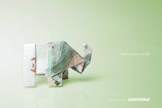
This assignment required me to create a print campaign for Greenpeace. I chose to focus on the idea of ‘the price on life’. Many people say that one cannot put a price on life but in the case of saving the environment and animals living in the environment one can. Greenpeace is also reliant on donations to contribute to saving the environment and animals living in the environment, which adds to the idea of putting a price on life. ‘The price on life’ also applies to human beings, as we cannot survive without the environment.
Expres
This assignment required me to design a graphic identity for the launch of a new range of coffee in South Africa. The range for the product needed to consist of mild, normal and strong. The name of the coffee is Exprès meaning “especially for”, targeting women aged 25-30 years. The concept behind the packaging is to represent the different strengths of the coffee through different styles of curls. The curls relate to different ways in which women style their hair.
Subscribe to:
Comments (Atom)


